Visual Redesign
I redesigned this site using Tailwind (previously designed with Bootstrap) and here are the results. I’m really pleased with how the new design came out, and especially at how the frictionless the design process was. Even with a relatively simple site, I felt like I was fighting Bootstrap to make things look exactly how I wanted. I accomplished this in a weekend, including adding a number of subtle touches not shown in these photos such as responsiveness and animation.
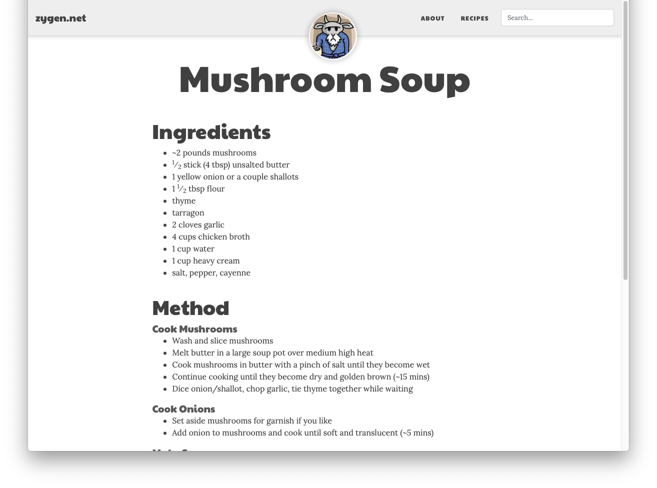
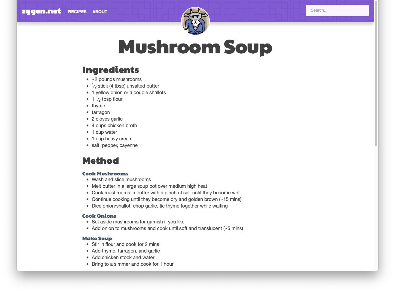
It’s hard to see in the static, scaled-down pictures here, but there were a number of small problems with the old design, such as the avatar not being centered correctly at all sizes, and the whitespace being looser than I wanted. The styles of the navbar were also intertwined, making changes difficult when I hadn’t worked on it in a while.
Old | New |
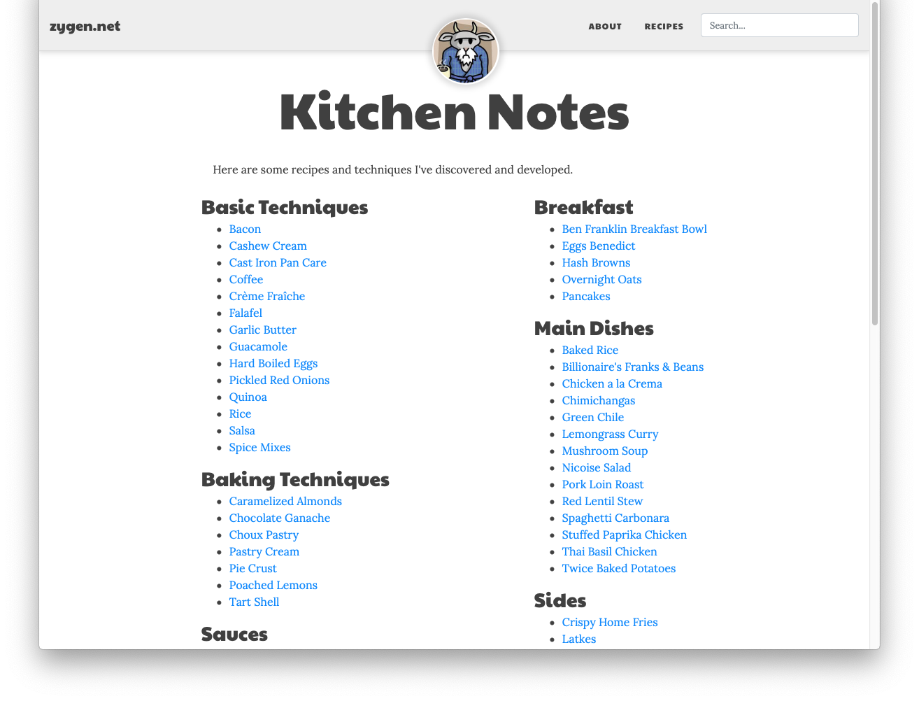 | 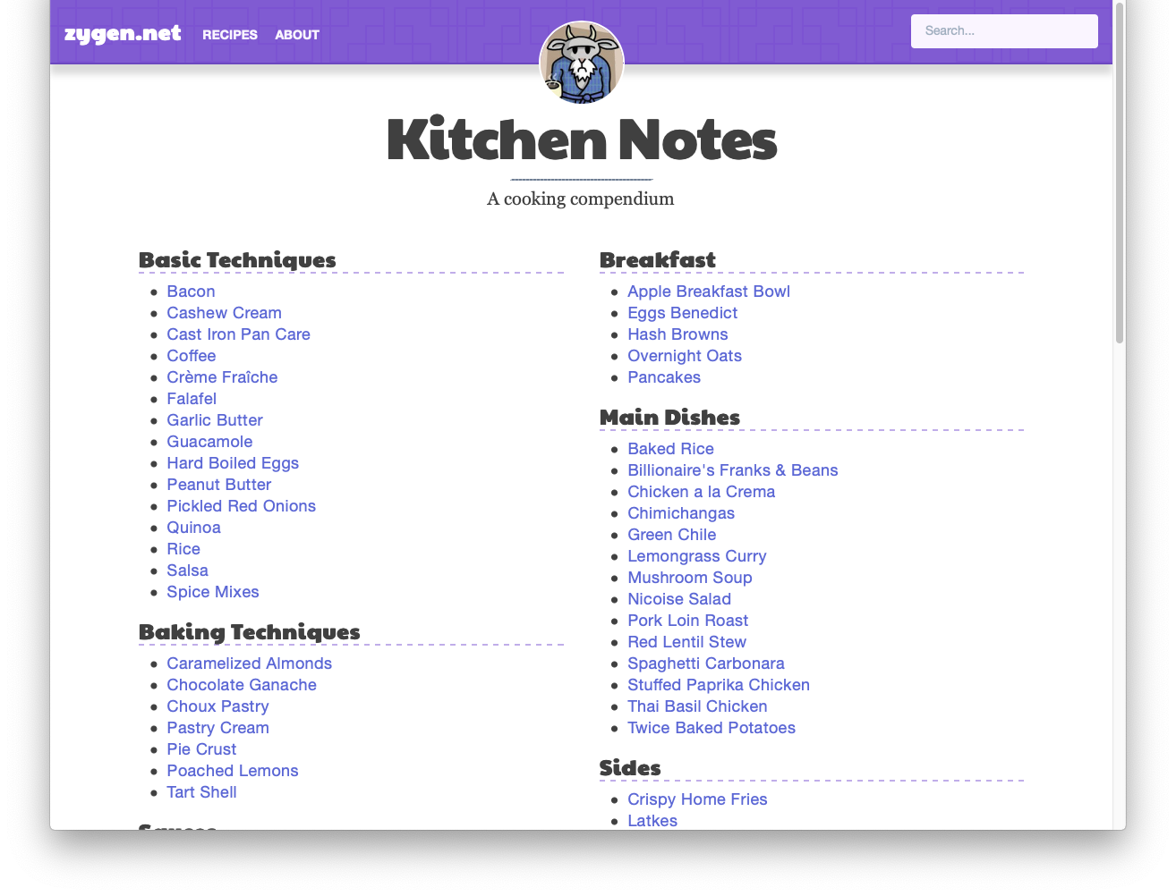 |
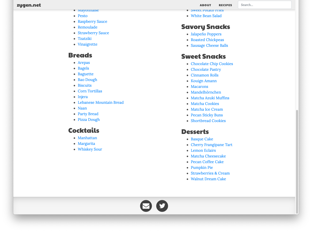 | 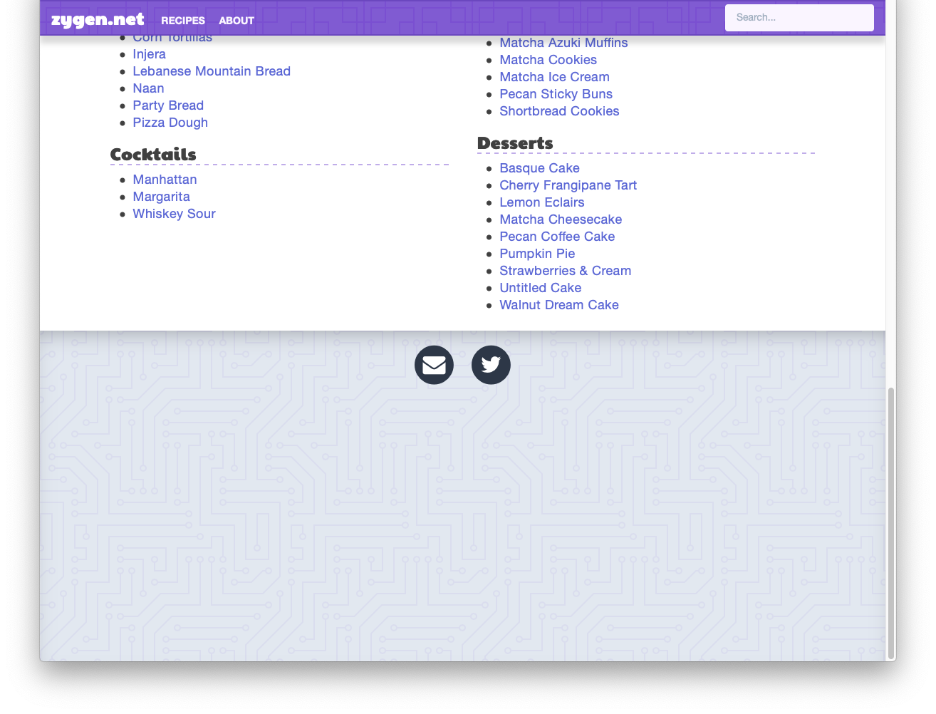 |
 |  |
Bootstrap is a framework to very quickly start building a website. Its purpose is to provide pre-made components that you can use to start implementing your idea without having to start from scratch. The downside is it’s harder to customize the site when you’re ready to take that step. Bootstrap sites are easy to pick out since they all look similar, especially when you start adding buttons and modal dialogs and tables.
I wanted to add some personality to this site so I could feel better about showing it off to people as a resource. So I set out to redesign the site and the first step was researching my options. There are a number of frameworks out there (Bulma, Material UI, Semantic UI, UIkit, …), most solving a similar problem to Bootstrap. I was looking for something more customizable. I’ve been hearing a lot of people talk about Tailwind lately, and it was interesting to me because it’s so different from how we’ve been told we should approach CSS.
The traditional guideline is that HTML should be purely semantic, with CSS being the completely separate presentation layer. Therefore at first glance, the Tailwind approach of shoving all of the styling info into the class property of the thing you’re styling seems crazy. You’re very tightly coupling presentation to each component. However, that advice is rooted in a different time, when it was theorized users would have their own custom stylesheets that they would apply to sites as they browsed. I don’t believe this is a concern nowadays, and in fact when designing you usually care exactly about how that component looks in the context of where you’re placing it. This approach also alleviates the cognitive overhead of having to come up with class names for every small piece and manipulating those in multiple places.
After reading the core concepts of Tailwind, the utility-first approach made a lot of sense. Being able to literally copy in a component and have it render exactly as it’s supposed to without changing dozens to hundreds of lines of CSS seems like magic at first. It’s freeing to very quickly iterate on a component design without worrying about how it’s going to affect the look of anything else. If a style is truly global, it’s easy to factor that part out once you’ve established that fact. Once I got started, converting the full design to Tailwind and removing all Bootstrap pieces took only a couple of hours, with another few hours of tweaking to get everything just the way I wanted. I deleted all of my old CSS and am left with a small file of custom base styles that I chose myself.
Working this way is a more ergonomic developer experience. The best way to describe the difference is through a physical workspace analogy. Designing components the old way is like having all of your tools stored in a number of junk drawers. To work on a component, you need to find the right drawer and then dig around and find the tool you’re looking for. Designing with utility classes feels like having first order retrievability. The tools are ordered and on display, you can simply pick the one you need right away.
Where Tailwind really shines is in component-based frameworks like React. I also converted a meal planning app I’m working on to a Tailwind based design, and result feels a lot nicer to me and looks less generic. I was already styling components inline because that made sense to me according to how React works; this just made that process a lot easier.
Tailwind has its own tradeoffs, of course. You have to understand CSS more fully to use it, but if you’re designing a site right, you should understand it well anyway. You still run into some of the same problems, like the box model not centering or aligning things correctly, but at least good design is baked into the utilities and the problems are easier to isolate and solve. I feel more in control of the full presentation of the site, and I’m no longer relying on any magic from a framework, since I essentially made my own. So now I’m never going back.